School flat plan and ideas


Before making and producing your magazine it has to be designed, so i gathered the information that i wanted my magazine to include and put together an idea of what i wanted my magazine to look like, it is shown on the right. But i discovered some things that i decided i wanted to change about my magazine after roughly designing it on paper using pens and pencils. I decided that i would keep the name, slogan, interview idea, prize and theme of stars throughout the front cover the same and bring them aspects through to my final school magazine. However there was a few things that i wasn't happy with and therefore i will change them, the picture on the front of my magazine i discovered would be more appealing to be of a person or two.
I think that by including a barcode, price and issue date/month makes the magazine look professional therefore people would find it eye catching and have more intention to by it. I decided that the magazine should have a low price of £0.60 because if it was more expensive then students or parents would not be able to afford it, or would not bother reading it because they wouldn't think it was worth the price.


For my main photo on my front cover I had to do some of practice shots to see what sort of photo I wanted to use and what kind of background I wanted the photograph to have. After taking some shots I found out that it would be best to have a photograph with a very plain background so that my neutral colour text, captions and colour scheme would stand out and so that the audience would be attracted to the picture and also the captions and not just the photograph. Here are a few of the practice shots.


The first image is of myself standing on the steps, I tried this out because I wanted to see what the background would look like but I figured out that I wouldn't be able to see my captions with the dark surroundings. The two other pictures on the right side (top and bottom) I disregraded because I thought that the top one's lighting was poor and camera angle was more like school picture positioning. The bottom right photograph I decided against because the boy model's facial expression was boring and not appropiate for my school magazine and would not invite people to read the magazine.
Therefore I chose to use the bottom left-hand image as I think that the angle of the camera and lighting was perfect, the model's facial expressions were inviting. Overall I was very happy with this photograph being on my front cover.
I slightly edited the final chosen photograph on fireworks to completely delete the background so it was a plain white. Then I edited it on an online website http://www.picnik.com/, I used this website because I find it really easy to edit and alter the image slighlty. I used the effect called cinemascope to make the main image look more interesting and appealing.

Questionnaire evaluation

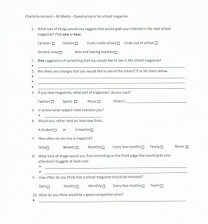
We was asked to make a suitable questionnaire to find out what the audience of my new school magazine wanted to see inside the magazine and to get some ideas as to what they was interested in. The audience for my magazine was sixthformers, so i handed out twenty questionnaires, all to sixthformers. When i got them back i analysed them to get a good idea on what i would include and what the target audience was interested in. Here is what i found out:

From question 1- The most popular type of news that the students answered that they wanted to see in their magazine was 'general news'. This is a wide idea so i am able to include lots of stories and everything that i think is neccessary.

From question 2- This question has a big connection to the first one, but i gathered a few different suggestions of what people would also like to see in the magazine that i hadn't included on the first question. I found out from the feedback that information about university would be helpful to sixthformers. Horoscopes was a popular idea which ovbiously interests this age group and you see these in professional magazines but not school magazines, so this could be different and interest people.

From question 3- I didn't find this question very useful to gather information from. Being a sixthform student myself i think that the only answer from somebody that i had a connection with was an answer saying 'having a student carpark'. I think that this would be great because then students, sixthformers would be able to drive to school and feel more independant.

From question 4- This question wasn't very constructive because the information that i got from it wouldn't have any impact on my actual school magazine but helped me to build an idea of what interests students in this age group.

From question 5- I got the same conclusion from this question as i did from question 4 it effective into finding out what i could include into my magazine but again helped me investigate my audience.

From question 6- I recieved the same answer back from every questionaire that i got back, so in i am going to include an interview from a student regarding something that people will be interested in.

From question 7 and 9- I found out that most people of this age group buy magazines monthly, so linking to question 9 i think that this school magazine should be issued monthly.

From question 8- After getting the information back, i decided that this question wasn't very successful as everyone put 'a student', which was an ovbious answer and this is what the main image was mean't to be of.

From question 10- I recieved a variety of different answers from this question, so i have got many different ideas to choose from which will appeal to sixthformers because it is what they have suggested.

Overall most of my questions was successful as i gathered valid and useful information from and got a good idea about my audience. A few questions wasn't so successful so i can almost disregard them.

Preliminary Task

We have been given the task to design and create a front cover for a school magazine, featuring a masthead, main photograph involving a student and appropriately laid out text.

Points to consider
I decided that i would like to aim my school magazine at students the same sort of age as myself, 16, 17 and 18 year olds - sixthformers.
I chose '6uccess' for my magazine name because out of my other potential names it was most appropriate because that is the main aim of sixthformers. Another reason was that using '6' instead of 's' made it look effective.
I'd show a main big image of one sixthformer carrying a pile of books, i thought this was a good idea because it linked to the name of my magazine '6uccess'. And also relates to one of my main topic's which is about university because piles of books is stereotyped at university and students carrying around loads of books. (That was my original idea, but I then decided that even though this was mean't to be a school magazine about focusing on studying, I realised that school is not entirely about studying, but also other aspects, for example having fun, meeting new people, making friends, bonding, and learning about the world around us. Therefore I changed my idea which Is shown on my flat plan to a photograph of two of my friends laughing, but showing them in smart clothes so they don't look casual and hints at the school magazine genre).
I am also going to include small text hinting on news and information that will be in the magazine so it grabs the reader and makes them want to read to stories inside. At the bottom of the front cover i'd also like to include a hint about the competition and the prizes given to that it interests the audience.
In my contents page i shall include a list of the main events included in the magazine and the page number in which they are on so that if that is the only interest they have in the magazine they don't have to waste time looking at other stories that doesn't interest the audience. Also possibily a few picture on some of them events if relevent. A breif synopsis of the contents of the magazine and what's going on this month!

School magazine names

I have come up with 3 potential names for my school magazine and connotations of them.

Choice one:
Sexformers - Playing with words; 'sixthformers'. I chose 'sex' instead of 'sixth' because it represents adolescent, young adults and sixthform students are of there age where 'sex' is regularly spoken about. I thought the two words 'sex' and 'formers' flowed quite well together as one word. Another thing that i thought linked to this potential magazine name was the word 'transformers' because sixthform is the transformation from kids into young adults, it is a new stage of life.

Choice two:
Sixducation - The 'ducation' part represents 'education' which is the main aim of sixthform, learning and being educated. I put the two words together 'six' and 'education' to make the name sound professional but i took away the 'e' from 'education' because it makes it flow better and sounds more intriguing. This name is similar to 'sex education'.

Choice three:
6uccess - I thought that this name was relevent to sixthform because the '6' acts a an 's' so therefore the name would be 'success' which is important for sixthform because you need to be successful in school to get into sixthform, and then you need to be successful in sixthform to get into university, college or the job that you wish to do. I used '6' instead of 's' because the magazine is mainly aimed at sixthform students.

Magazine research


I like the layout of this Vogue magazine cover because i think that the colour scheme compliments and highlights the model's eye's. The standard title at the very top of the page shows what magazine you are looking at and the plain big writing stands out and is easy to read unlike some titles or texts that you see in magazines. The information on the left hand side makes the photograph of the model stand out and catch your eye. The plain black font appeals tome because if it was different colours or fancier then it would make the page confusing and not as formal, especially for the target audience in which the Vogue magazine is aimed at. Also how the text is different sizes, small and large, makes the most important words stand out compared to the smaller less important words and phrases.


I like the way that this Cosmopolitan magazine slightly hides the title with Jessica Alba staring on the front page, this could suggest that everybody knows about this magazine or the people who buy it, buy it regulary so they know the title. The colour scheme is pinks, but black and white has been used on top of the pinks so that the text stands out. The pink colour scheme could suggest that the main target audience is women because it is more of a feminin colour. Alot of the text has been made bold so that that certain piece of text stands out from the rest of the text that is not so important. The main photograph of Jessica Alba is the thing that attracted me the most to thing magazine front cover because of the bright outburst of colour that her skin is contrasts against the subtle background of baby pink.


I decided that the two previous magazines that i analysed were quite similar and didn't go into much detail, therefore, i extended my knowledge and research into magazines and analysed two more magazines that were completely different to the others and each other. I then reviewed and evaluated the magazines 'Country life' and 'NME'. Country life is a magazine focused on houses in Essex and advertises houses for sale, soft furnishings, bath rooms and kitchens. The 'NME' magazine is a popular music publication in the United Kingdom and includes music news, reviews, festivals, concerts, tickets, charts, tours and clubs. Both are analysed below.

These four magazine cover's are all very different in terms of appearance. 'Vogue' has an image of a zoomed in woman's face, similar to 'NME' but the model is male slightly more of his body is included, whereas 'Cosmopolitan' is a much longer short including the tops of the model's legs. 'Country life' is completely the individual compared to the other three magazines as the photograph on the front, as the background in this case, does not include a person but a house in the country side. This magazine cover is also very different because the actual image has been used as a background for the cover. The other's have got plain backgrounds around the model's and are not busy like Country life which has the house surrounded by plants and greenery. Another reason why 'Country life' appears different compared to the others is because the text on the cover has been laid out completely different. 'Cosmopolitan' and 'NME' both have captions around the main image, 'Vogue' has their captions to the left of the image and 'Country life' has only a few which are placed below the main focus of the image (the house). The caption is almost simply displayed as a small sentence. In most professional magazines they use three main colours and stick to them otherwise the covers look unprofessional and inexperienced. 'NME' and 'Country life' have used the same three main colours; red, black and white. Which shows that for each type of magazine there is no specific colours that are used its just what suit the author and what they think the audience will like. This is proven because 'NME' is a music magazine and 'Country life' is a country-side housing, in which neither of them have connections. 'Vogue' and 'Cosmopolitan' are both similar types of magazines, and both look into fashion, but have opposite colour themes; 'Vogue' with blue, black and creams. And 'Cosmopolitan' with pink, black and white.


BCHS AS Home

www.bchsas.blogspot.com